Afronation is the biggest African Festival of Music (African Music). It takes place at Portimao in Portugal every year. I decided to remaster the landing page of the festival ticket shop. Focussing my work on the usability of the website.
☕︎Product: Website
⌚︎Duration: March 2024 - April 2024
⚠︎ The problem: Complexity of the User Journey to purchase ticket.
☆ The goal: Optimize the accessibility of the website. Reduce the navigation path.
⍟ My role: UX Researcher and Visual Designer.
❂Responsabilities: Usability study, prototype.
☕︎ Usability Study:
Study type:
-Unmoderated
Participants:
-3 participants
Location:
-Italy, remote test
Lenght:
-20 minutes
⍟ Findings (study's results):
There were majorly concerning by the accessibility of the website:
1. The users were not able to remove singularly items from the shopping cart. ☹︎
2. The long scrolling pages upset them. ⇡
♺ Refining the design:
I found that users are bored about the list design.
Moodboard:
All in one then... ↓
The design is original but with a lot of information hidden. The website needed a good figuring of the "Above The Fold" principle. Consequently, with the new design at the right, the user has the info without scrolling (and doesn't need to memorize before scrolling).
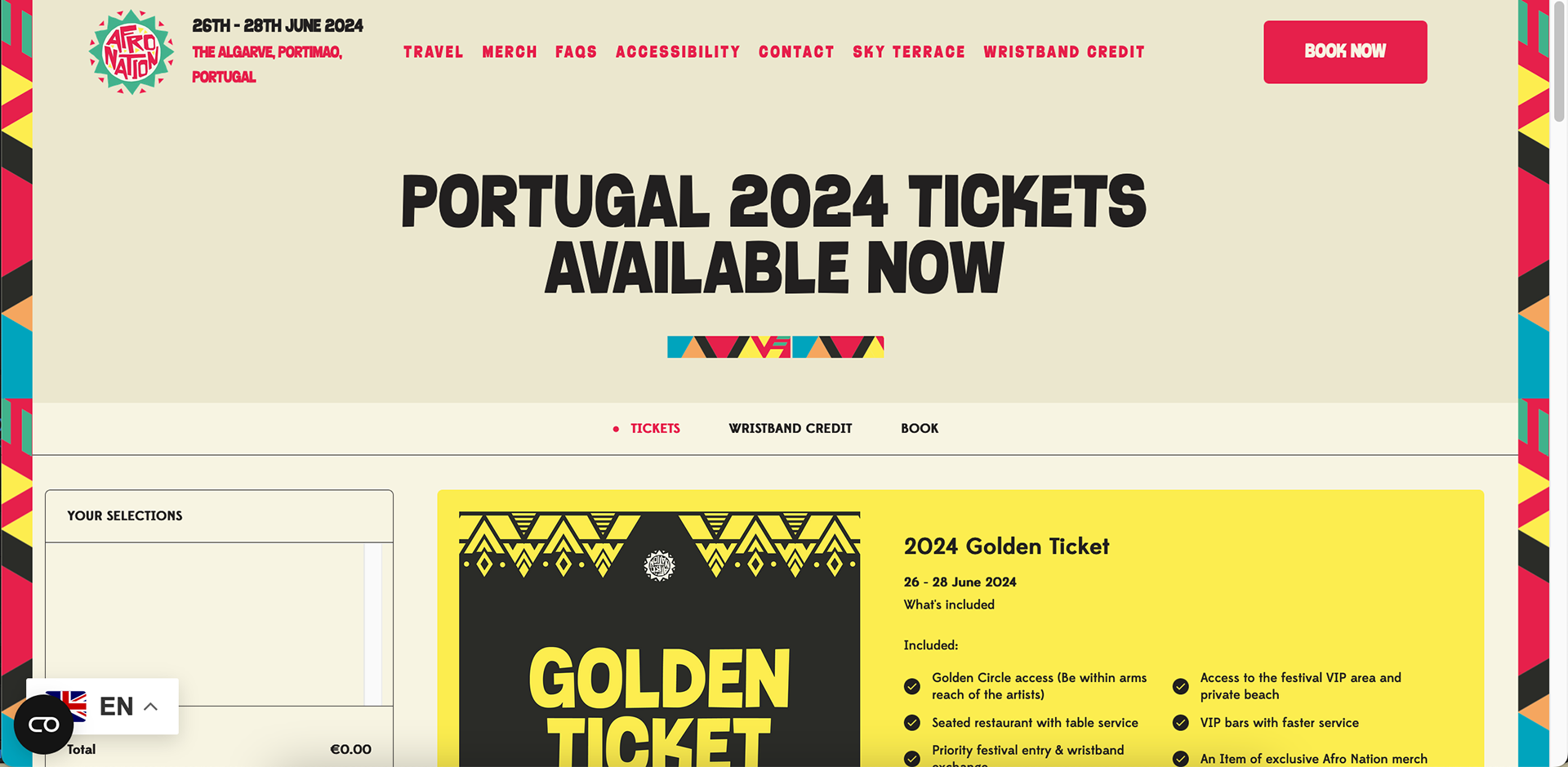
BEFORE
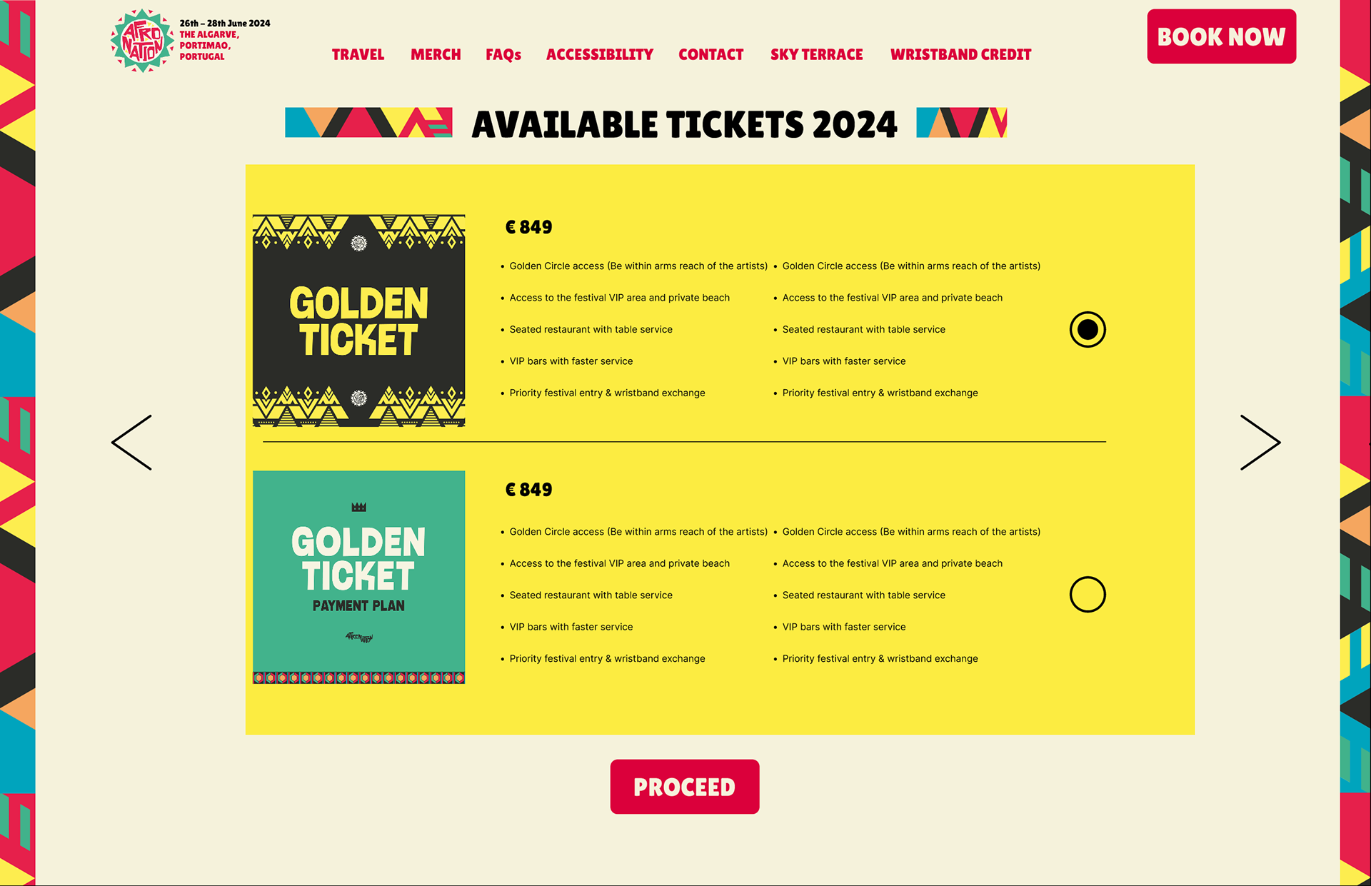
AFTER
Then, it was necessary to set an overview page of actually what the user address on the previous page before paying.
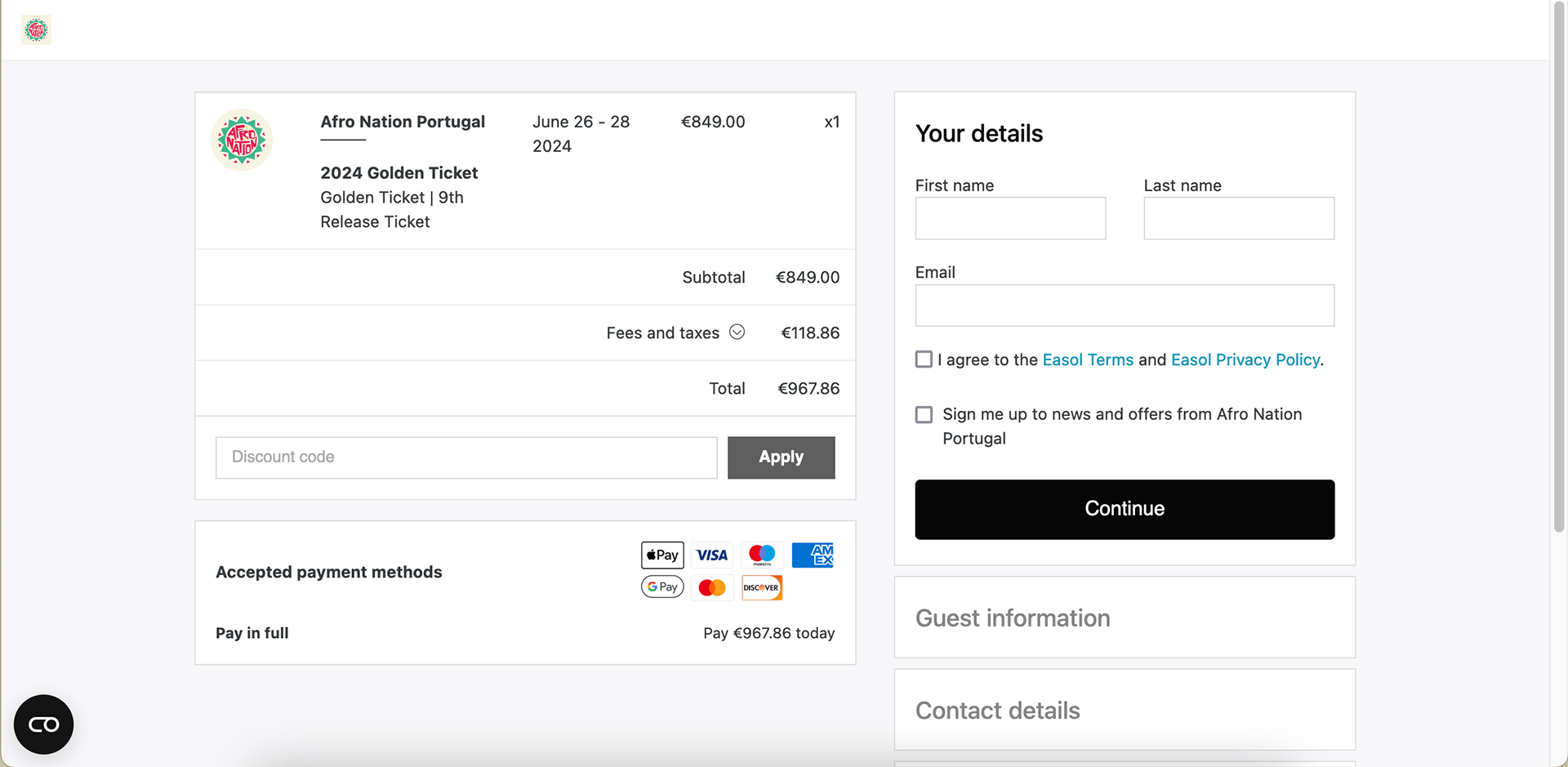
BEFORE
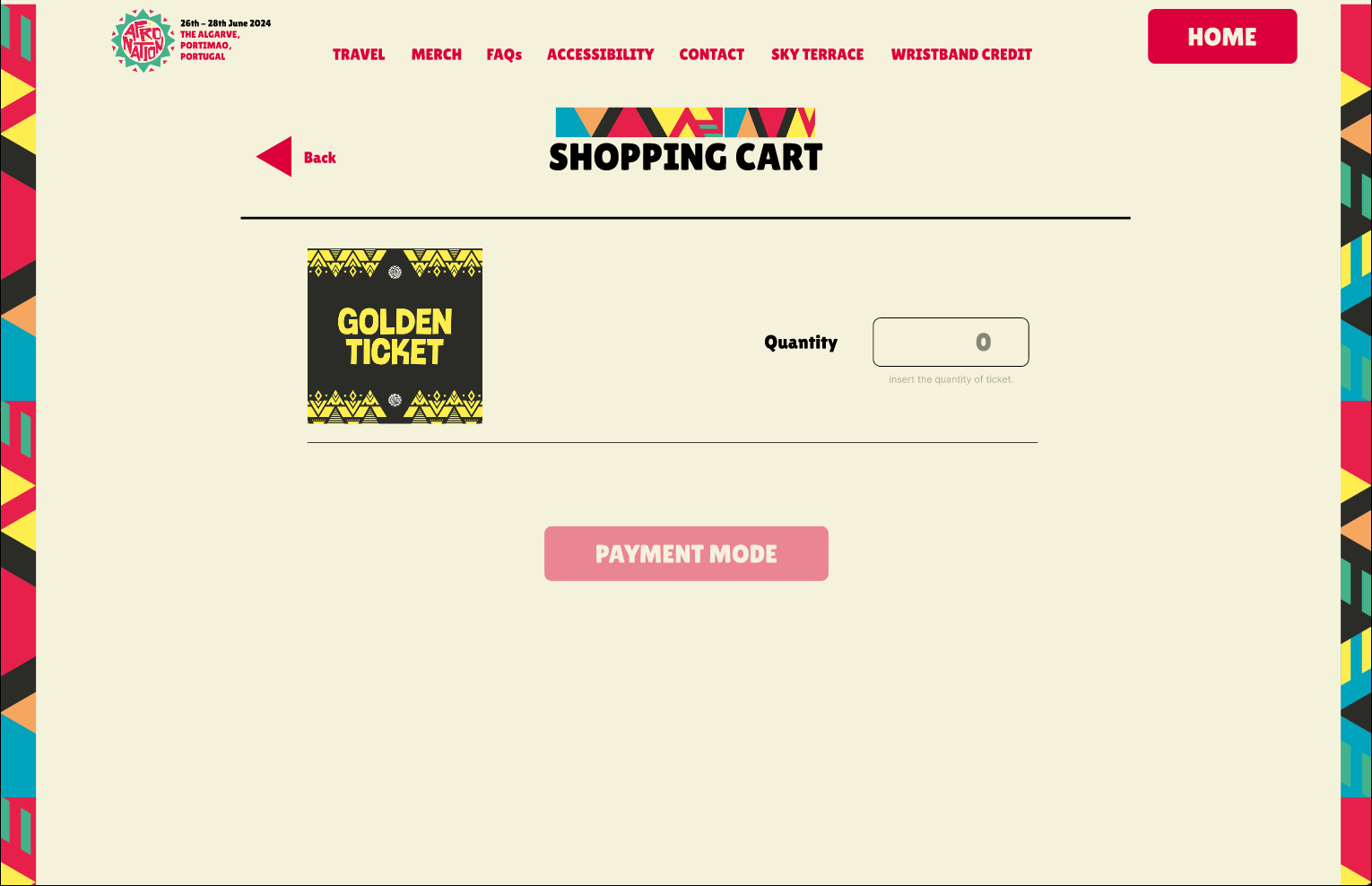
AFTER
☺︎ THE NEW DESIGN:
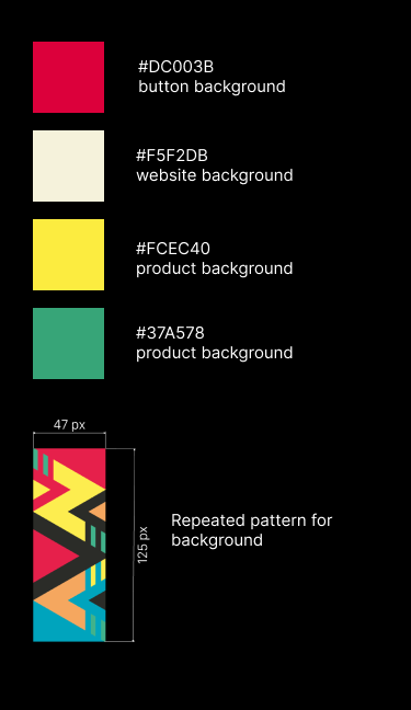
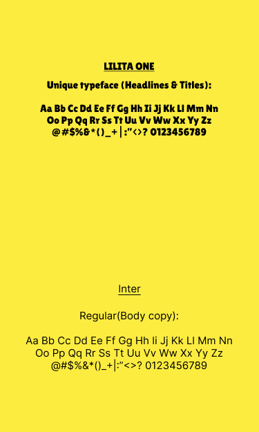
COPYRIGHTED ASSETS (coloring & pattern)
Owned by THE MALACHITE GROUP
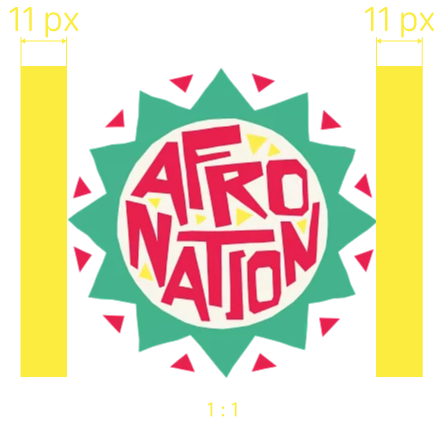
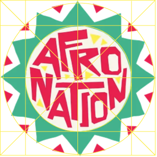
COPYRIGHTED ASSETS (logo sizing & padding)
Owned by THE MALACHITE GROUP
Homepage...
To the checkout...
♨︎ High-fidelity prototype (Hi-Fi):
We decided to fully reduce action to choose between the ticket and easily compare them. We grouped the ticket with similarity for easy-understanding also.
We enhance the User Journey along the website by discreetly showing the navigation path to the user.
♿︎ Accessibilty considerations:
1. As we are talking about the website of a famous festival. Ticket has a limited availability. So users should understand and navigate quickly to purchase tickets. The usability study demonstrates the frustration of people when there are confused through the interface.
2. We reduce the sentence with low priority (title and button).
3. Reinforce the flux on the website with ad hoc advertisement in Portimão street. ↓
Rights owned by THE MALACHITE GROUP.
☑︎ Takeaways:
This work guaranteed a Task Completion of the User journey in only 2 min. 95% of user note the experience with 4 star in 5.
This project has taught me that is important to design interface in a way to set important thing immediately visible for the user (without scrolling).
⇢ Next Steps:
1. Create a mobile app to facilitate a purchase. Like that users will no longer need to login or register every time.
2. Add diverse payment mode as PayPal, Apple Pay, Samsung Pay. This will increase the costumers and give more inclusivity.
✉︎ FOR MORE INFORMATION.


